BBQGuys Brand Evolution
Role: Design Lead / Art Director — Partnered with the Senior Brand + Creative Director (brand strategy) and Copywriter (voice + tone) to define the new design strategy for BBQGuys. My responsibilities included:
Auditing the existing brand to identify gaps in consistency, POV, and systemization.
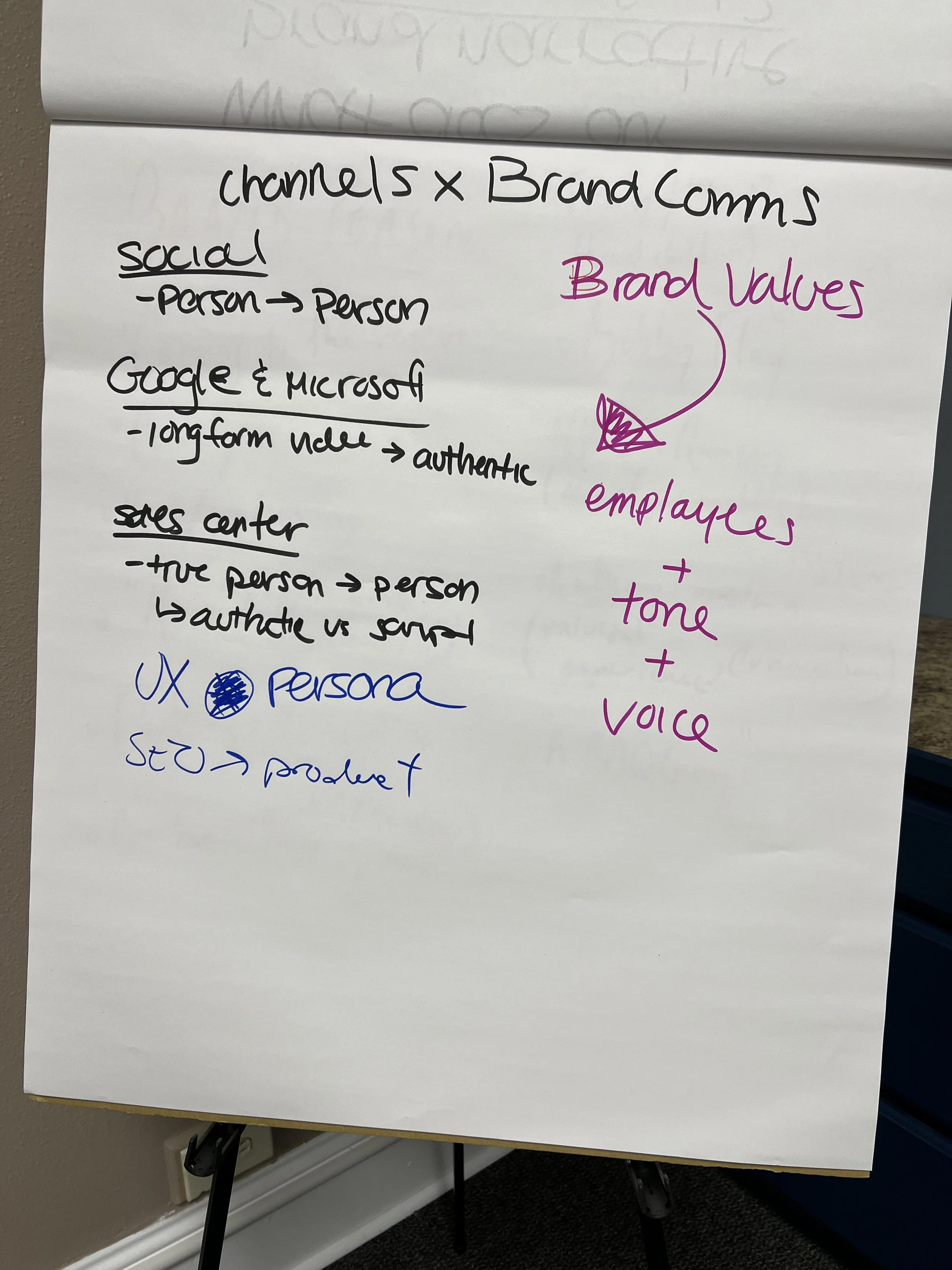
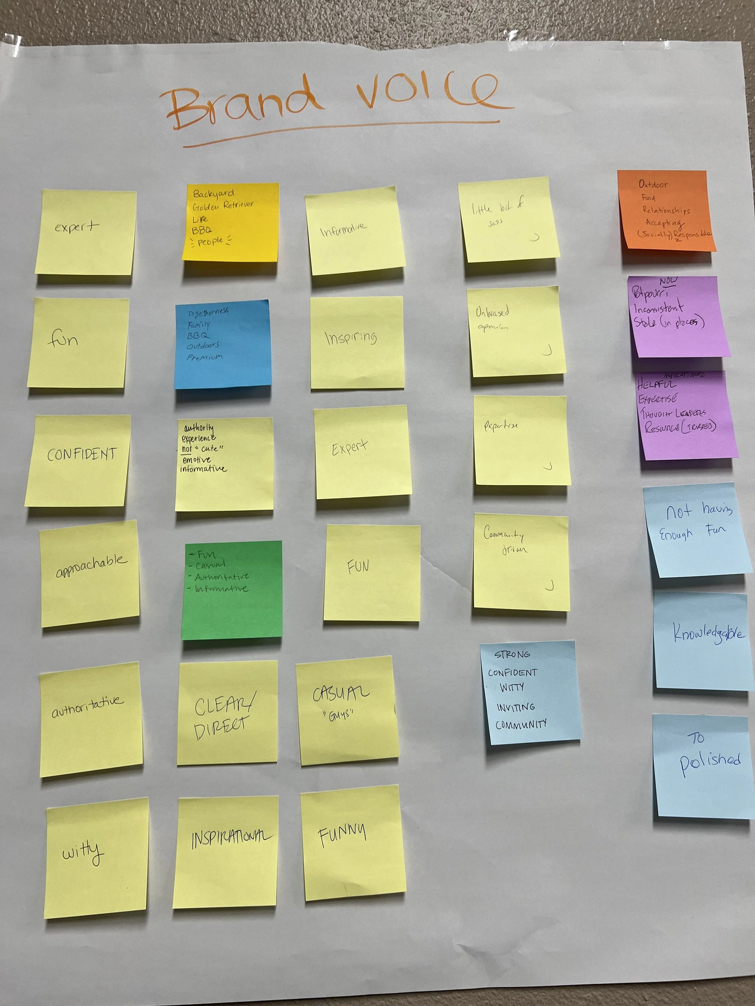
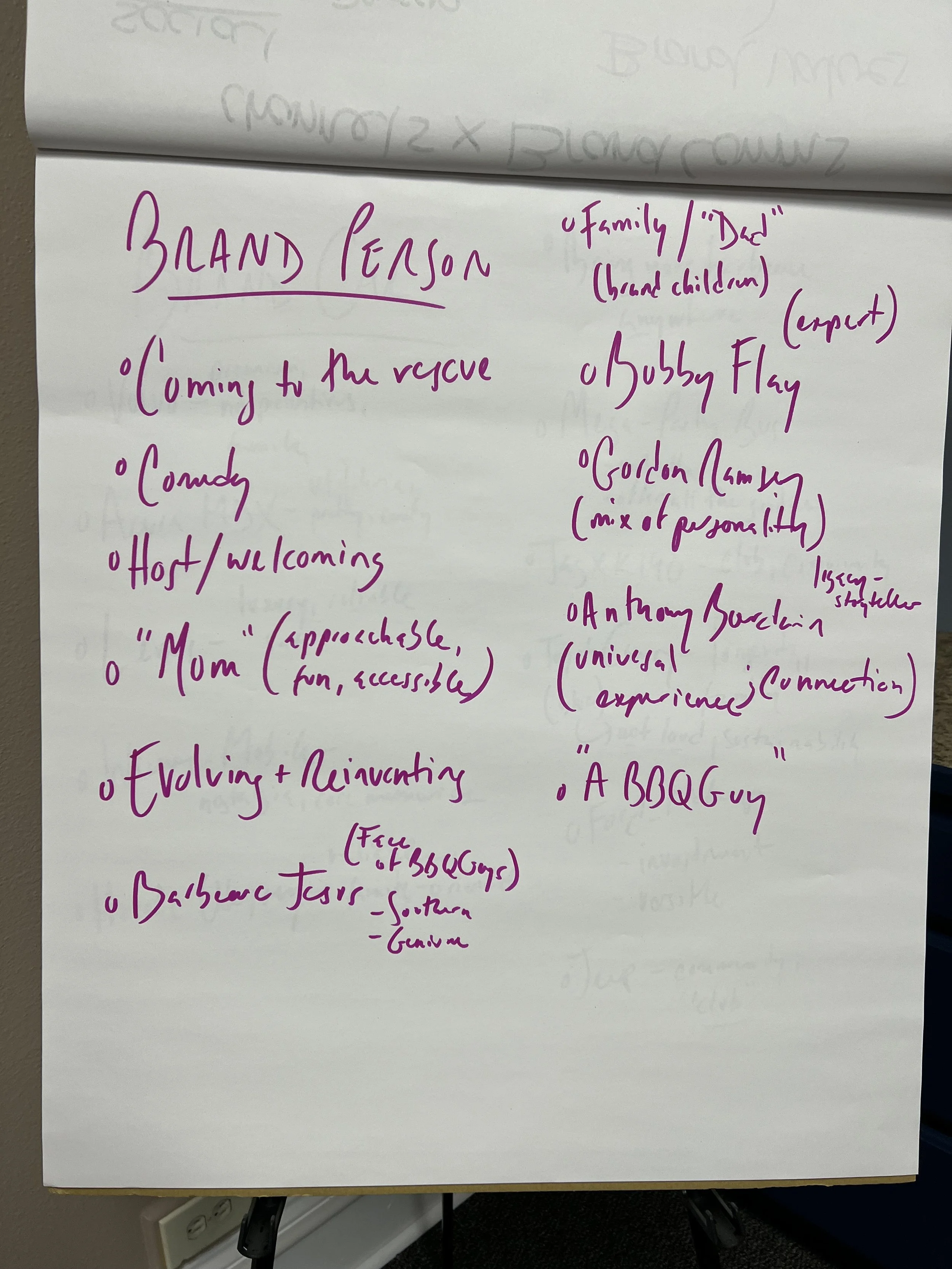
Leading a creative workshop in Baton Rouge alongside Copywriter with marketing stakeholders to align on vision, tone, and design opportunities.
Developing the new design expression — typography, color, photography, and updated identity.
Building out the brand guidelines (digital brand guide, templates, design systems in Figma).
Rolling out supporting materials and templates for marketing, sales, and internal teams
-
BBQGuys has undergone several evolutions since 1998 — from Grill Store + More in Baton Rouge to an e-commerce leader. By 2019, everything consolidated under the BBQGuys name.
By 2023, the brand was ready for its next growth phase: moving beyond “Born to Grill” to “Life is Better in Your Backyard.” The objective: position BBQGuys as the lifestyle brand for outdoor living — not just grills, but the full backyard experience
-
Unified Identity: Moved BBQGuys from a tactical, grill-first brand to a category-owning lifestyle brand.
Operational Efficiency: Systems reduced ad-hoc creative, enabling channel teams to move faster with guardrails.
Brand Equity: Positioned BBQGuys as synonymous with outdoor living — “the only retailer focused wholly on the outside part (the best part) of your home”
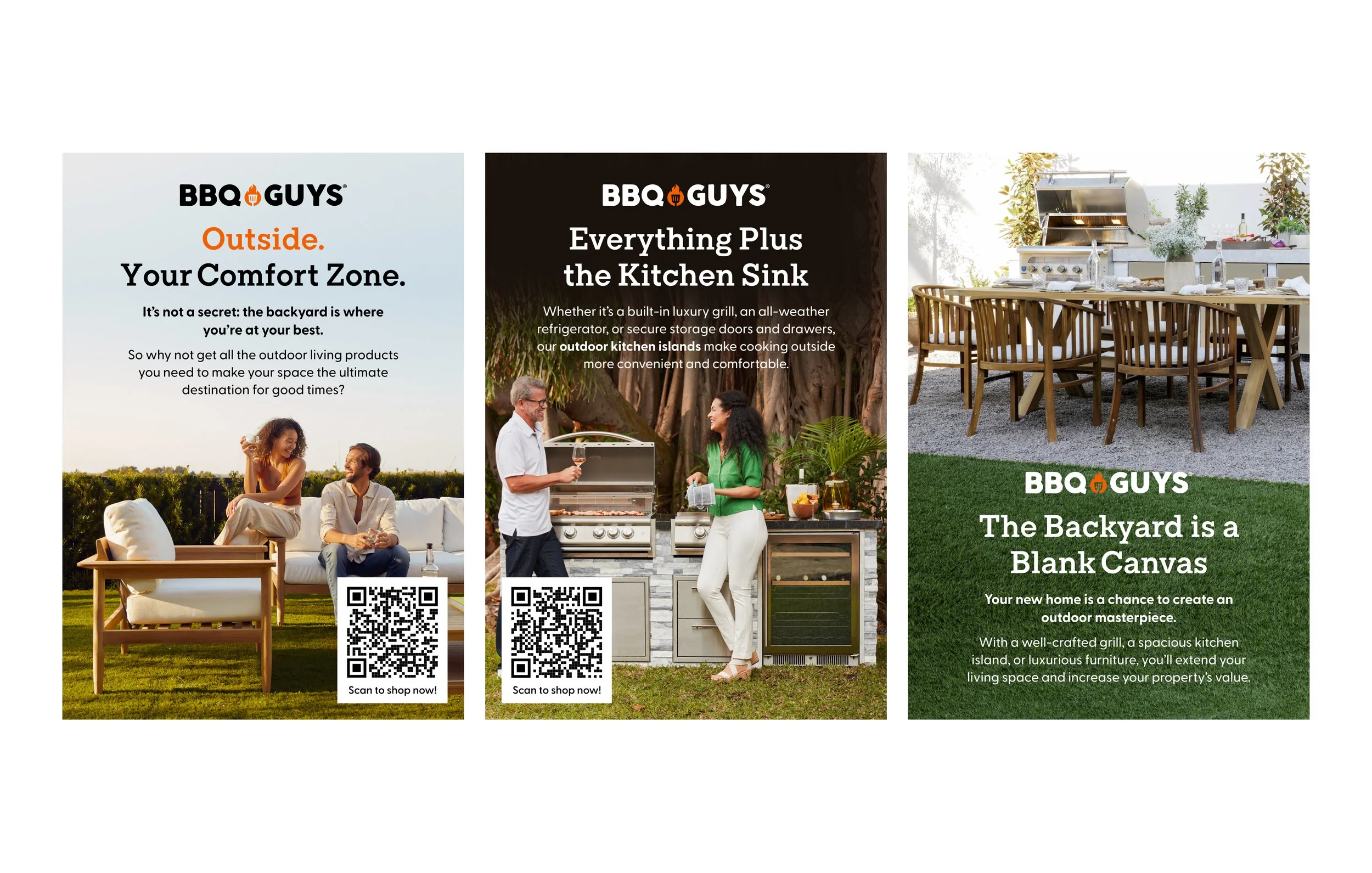
Creative Consistency: New guidelines influenced major campaigns beginning with Back to Backyard Spring 2024.
This is a snapshot of the previous brand
Too much for customers to digest — lacked clarity and hierarchy.
No clear point of view — failed to distinguish BBQGuys from competitors.
Custom-built everything — no systems for automation or scaling campaigns
New Brand Expression
The evolved design system was informed by strategy and storytelling while keeping execution scalable:
Authentic Storytelling: Tells the BBQGuys story in a compelling way across every touchpoint.
Cohesive Visual System: Creates memory structures and consistency across campaigns, photography, and voice.
Multi-Sensory Engagement: Inspired by the backyard experience — sight, sound, smell, touch, taste.
Scalable Design System: Flexible enough for big campaigns, PRO materials, and everyday channel needs
-
Cleaned-up hierarchy for better readability and consistency across brand, campaign, and product.
Subtle refinements to the logo (flambeau repositioning).
-
Expanded beyond “BBQ orange” to a system of warm and cool tones that flex seasonally.
Balanced bold accents with neutral supporting colors to allow product + photography to shine.
-
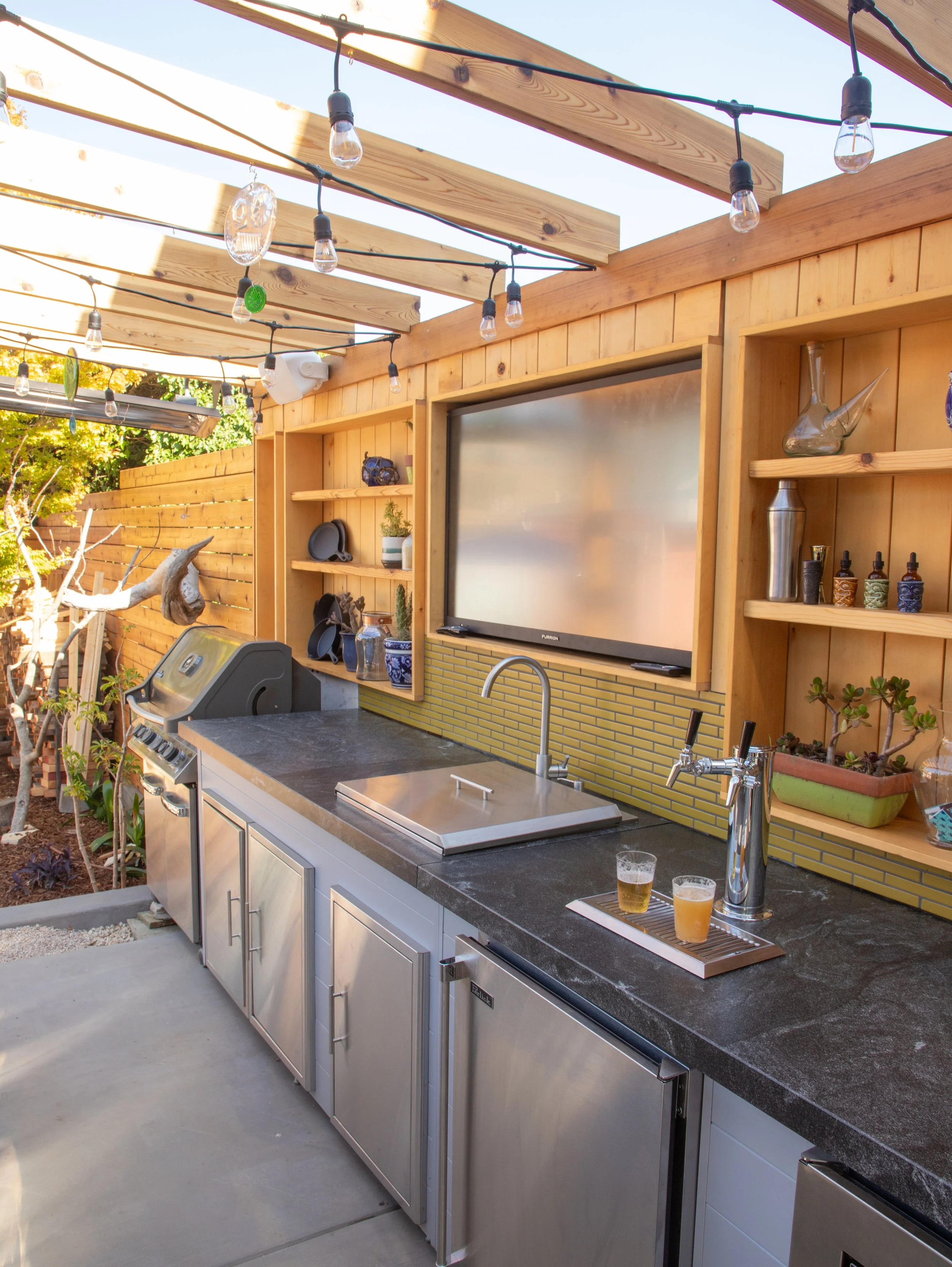
Developed new photography guidelines tied to the brand belief: “The backyard is the best room in the house.”
Emphasized lifestyle imagery (people in backyard and product environmental) over studio shots, capturing the emotion of outdoor living (gatherings, comfort, status, utility) and product usage.
-
Created Figma design system + digital brand guide (Brandfolder).
Built internal comms materials like email signatures, presentation templates, and supports HR + team.
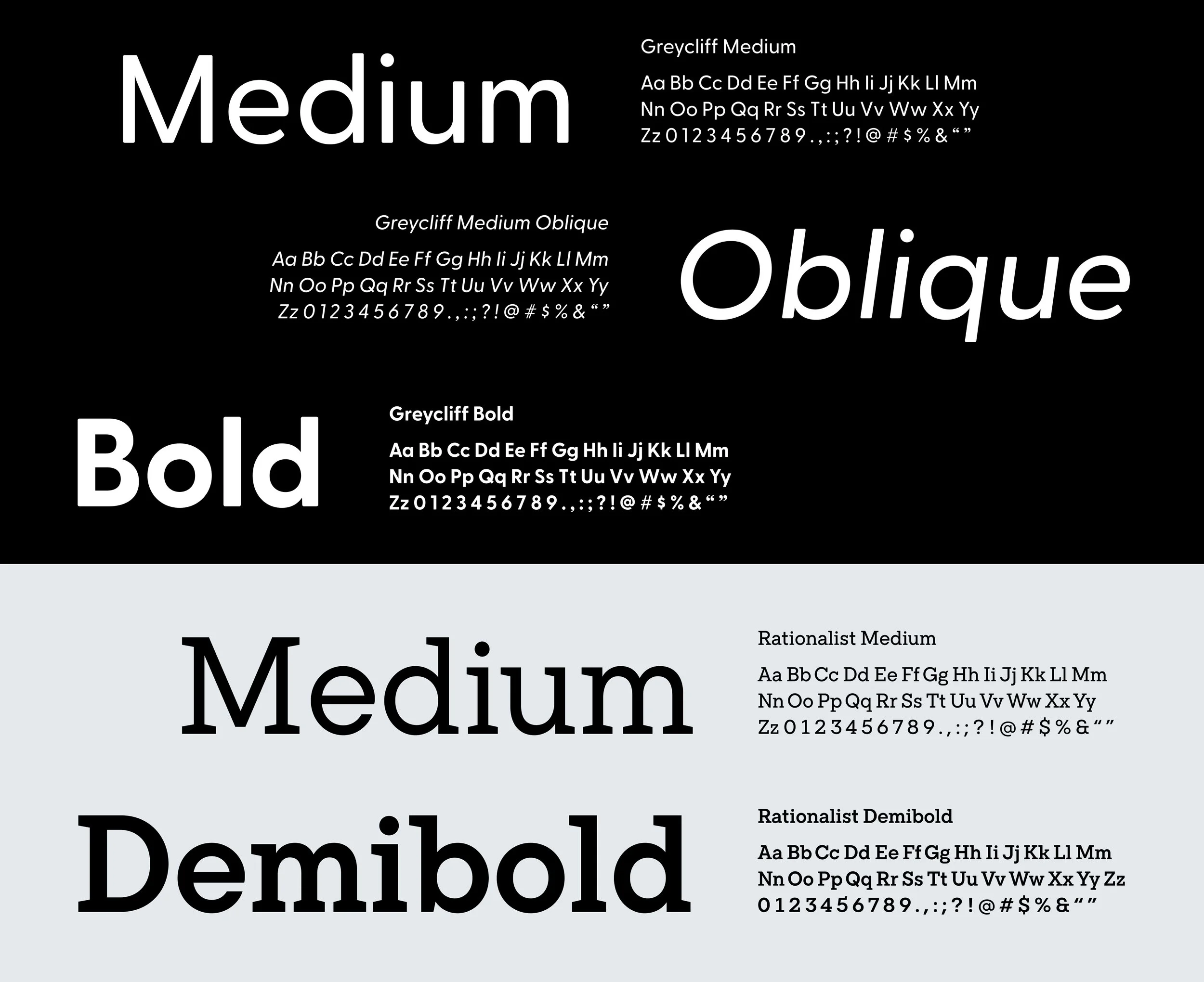
Typography
-
Greycliff is our sans serif typeface, which is a constant in our brand.
Our most versatile typeface—it’s balanced, easy to read, and its rounded nature reflects the best part of life: the backyard. Greycliff offers a variety of weights and usage just like the range of products we offer for every backyard.
-
Rationalist is our serif typeface, it adds humanity to our brand and is used for more expressive moments. Moments that we want to call at any stage of building your backyard. We are here to celebrate all the big and small moments of our customer’s backyard journey.
Rationalist is confident and approachable—sacrificing neither quality or function because we stand behind everything we do (and offer).
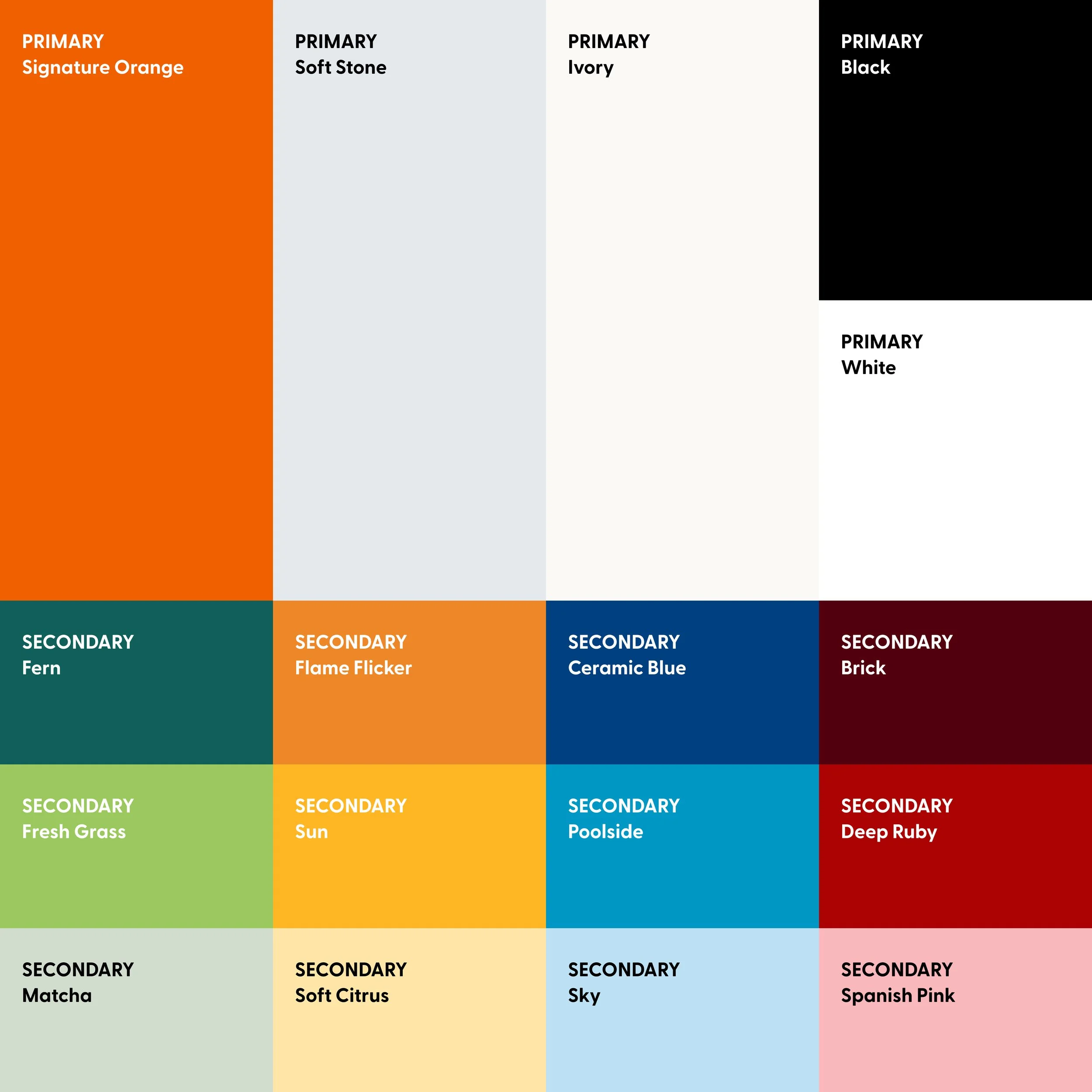
Color Pallete
-
The primary palette represents who we are: the outdoor living experts™.
The primary palette focuses on neutrals of the backyard to highlight our Signature Orange in an elevated composition. Soft Stone and Ivory is our backbone and these colors should appear in all activations with the presence of our Signature Orange in either text or our identity.
-
Our secondary colors represents where we are: the backyard.
The secondary palette is fresh and inviting. It is informed by the colors of every backyard.
The set of colors provides moments of vibrancy and balance that evolves with seasonal trends and major brand events.
Photography
-
Brand POV: We believe that outdoor living spaces are where the best part of life happens.
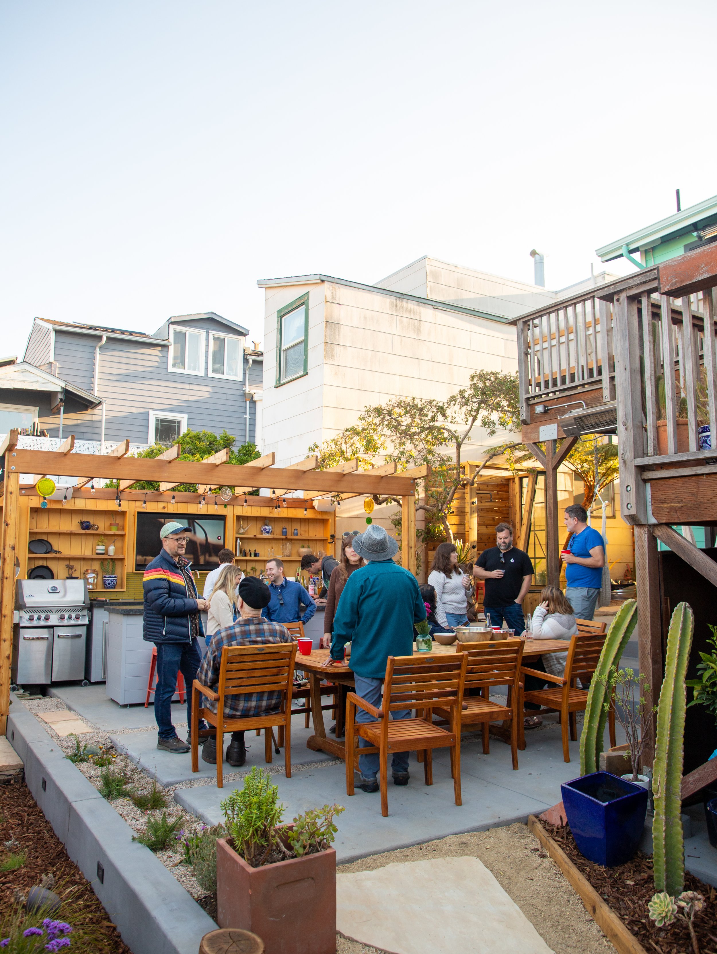
Our lifestyle photography focuses on the togetherness and happiness of a room without walls. Groups of people are captured in moments that is warm and happy—it should never feel staged. The story that the image expresses should be the primary focus of the image.
Motivation: Community—real and authentic spaces
Focus on: Storytelling
Mood: Warm, happy, authentic, welcoming
Examples of moments: Sharing a meal, taking a photo, and play (dancing, eating, celebrating, laughing)
Things to consider: Diversity (age, race, culture, gender, body type, and beyond), product inclusion, and environments
-
Brand POV: Life is better in your backyard™.
Our portrait photography focuses on individuals and the emotions they feel in their backyard. It captures the moments of excitement, relaxation, or contentedness they experience in their natural environments.
The primary focus should always be the human emotion. The imagery should evoke real and relatable feelings that is genuine and authentic.
Motivation: Real life, relatable outdoor spaces
Focus on: Individuality and emotions
Mood: Light-hearted, candid, real, and bright
Examples of moments: Eating and cooking, and relaxing (reading, sittng, listening to music)
Things to consider: Demeanor, a mix of eye contact, environments, and crops to allow plenty of space around the subjects.
-
Brand POV: We are experts in identifying, pricing, and featuring items that are better than the competition. The best life deserves the best products.
Our product environmental photography is clean and clearly features the products that we offer in an environment—the backyard. It can feature humans interacting with our products but should not be the primary focus.
The backyard should be well lit and not cluttered. Imagery should be approachable, yet inspirational
Motivation: Product showcase
Focus on: Environments and styling—it should be true to the setting while showcasing the diverse backyards we cater to
Mood: Approachable and inviting
Things to consider: Try not to showcase a singluar product but multiple products when possible
-
Brand POV: We believe in quality and only sell top-tier products vetted through our expert ratings and reviews.
Our product close-ups clearly captures the quality and detail of our products. Images should be hi-res and coupled with our product environmental photography. It should never stand alone without context.
Motivation: Product quality
Focus on: Crops, textures, tones, and crops
Brand Video Rollout
As part of the brand evolution, we launched a hero brand video to bring the new identity to life across channels. I collaborated closely with the Sr. Brand + Creative Director to shape the art direction, ensuring the design system, typography, and photography style translated seamlessly into motion.
Translating the refreshed guidelines (color, typography, photography style) into a cohesive video language.
Partnering with the director and production team to visually articulate the brand belief: that the backyard is the best room in the house.
Balancing storytelling and lifestyle moments with product and category representation.